Oggy-cheese's Banner
Oggy-cheese

Age/Gender: 17, Male
Location: United Kingdom
Job: Designer

Bringing you the best entertainment since sliced lead.

Contact Info

Newgrounds Stats

Sign-Up Date:
11/14/05

Level: 15
Aura: Light

Rank: Police Officer
Blams: 75
Saves: 520
Rank #: 13,538

Whistle Status: Normal

Exp. Points: 2,380 / 2,500
Exp. Rank #: 12,201
Voting Pow.: 5.72 votes

BBS Posts: 374 (0.25 per day)
Flash Reviews: 123
Music Reviews: 3
Trophies: 5
Stickers: 0

Entry #23

Jump to Entry: [ 1916 | 17 | 18 | 19 | 20 | 21 | 22 | 23 | 24 ]


Oggy-cheese

New website redesign! Hurrah!

Posted by Oggy-cheese Aug. 21, 2009 @ 5:56 PM EDT

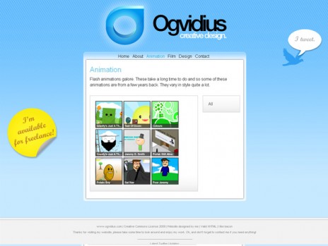
Lo. Just finished redesigning my site, it's taken quite a while and I really like the way it turned out. Here's an old screenshot for comparison.

www.ogvidius.com

There's a few extra pages, and it just generally looks nicer, the icons on the animation, design and film pages have changed also, and a new logo, of course.

It's very new so if you could test it and let me know if anything is broken, or you just want to comment on it, it would be really helpful. Thanks!

OLD VERSION OF ANIMATION PAGE:

oldwebscreeny2.jpg

Log in to comment! | Share this!

The People Have Spoken

6 Comments

Aug. 21, 2009 | 6:03 PM The-titan says:

really beautiful design mate, did you do all the xhtml/css your self? c: congrads! i like.

Aug. 21, 2009 | 6:08 PM Oggy-cheese responds:

I do indeed. Started learning it in January, it's quite fun :D Thanks, glad you like it!


Aug. 21, 2009 | 6:20 PM E-YeahStudios says:

0.0 It's pretty. Good job, exspecially for just barely learning site coding!

Aug. 21, 2009 | 6:21 PM Oggy-cheese responds:

Thanks! The coding bit was quite simple. It's the design that makes it look pretty, and i've been designing for years :D Glad you like it!


Aug. 21, 2009 | 6:48 PM ChromeShark says:

Really like it, love the glassy feel, looks very clean and inviting. Nice work.


Aug. 21, 2009 | 10:43 PM pinoyisazn says:

Pretty spiffy layout. The thumbnail of the front news post reminded me of skype, so I thought you were going to remodel it to resemble a lot of skype imagery. This is better though.


Aug. 22, 2009 | 5:51 PM Phil says:

It's all just put together perfectly.
I can't find one way to make the html or css neater.


Aug. 22, 2009 | 6:30 PM Miccool says:

ohhh sweet, I like it. Nice and simple.

Jump to Entry: [ 1916 | 17 | 18 | 19 | 20 | 21 | 22 | 23 | 24 ]